I'm Halak and today I have this layout to share with you.
Before we begin, let me list out the basic materials :
Paper Pack - Ephemera by Papericious
Round Ink Blending Tool by Papericious
Stencils :
1. Art Is - TCW
2. Labyrinth - TCW
3. Stylish Borders - Hero Arts
4. Rhapsody - Memory Box
5. Andy Skinner
Distress Inks :
Primarily used Wilted Violet and Picked Raspberries
Red striped washi tape and
Polka dotted washi tape
Inkadinkado alphabets and numbers cling stamp
Brads by Kaisercraft
A 1" circle paper punch (I've used the one by EK
Success)
And lastly,
Pink beads + Sequins.
Tip: If you do not have beads, you can opt for different
sized sequins too! Alternatively, micro beads / seed beads and glitter will also
look fabulous!)
Okay, so, layouts... what are they? Something on the lines
of a journal, layouts are meant to add an image and jot down something, (a line
or two max) about that image... capture a memory and freeze it in time...
While journals can be highly personal, layouts are primarily
created to be displayed. They can be framed or bound in a book, the choice is
yours!
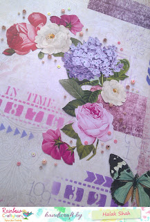
Here's a fun close up!
My layout is a 12" x 12" piece intended for
framing.
Let's get started!
The
first thing I did was open the paper pack and fussy-cut some elements to use as
embellishments.
After that I went through the sheets and cut out some
sentiments + punched out some circles using the paper punch.
Took the Andy Skinner + Hero Arts stencil and slowly
started building up layers.
Why stencils?
Stencils are a great investment, because unlike embellishments,
you can use the same stencils over and over again. They help give the illusion
of layers and add interest to a project without actually adding bulk to paper so
it makes your project look good without the added weight! Win-win!
Next, I took Labyrinth and Rhapsody stencils and added more
patterns to the paper.
Tip: If you want a dimensional look, you can use modeling
paste with fun ink sprays / acrylic paints!
After this, I took some alpa and number stamps by
inkadinkado and lightly stamped them in the background.
At this point, I was quite happy with the way the background
looked so I decided to stack up my embellishments + accessories to ascertain
positioning.
Tip: I always roughly position where I'd like to place my
embellishments / accessories and click a picture to make note of it. I move
around the pieces a couple of times, click pics and then pick the one I like
best. It's always a good idea to plan where the embellishments and accessories
go before you glue / tape them in place.
The next step was to adhere everything in it's place.
Once that was done I took a big white brad which had a
lovely flower design on it and added it to my project. Also added an additional
big butterfly die-cut.
Finished it off with some stenciling + added washi tape bits
and adhered the beads and sequins!
I absolutely love that floral arrangement decked with beads!
Here's another close-up :

But wait! If you think that was all then I have Surprise for you all
As
a bonus, Here's a card I made with a very detailed coloring
tutorial.
Materials used :
1. Altenew - Wild Hibiscus stamp set
2. Poppy Stamp Die - Hello Word Balloon
3. Big Shot or any other compatible die-cutting machine
4. Staedtler Luna Coloring Pencils (Set of 24)
5. Ranger Archival Ink - Black
6. Cardstock
7. Cotton swabs
8. Baker's twine (black)
9. Paint brush (I used size 0 brush)
10. And lastly, some embellishments like sequins and
rhinestones
The
first thing I did was stamp the flowers with the butterfly onto white cardstock
using my favorite, archival ink by Ranger.
I also took my hello word balloon die and die-cut the
sentiment I wanted to use in black cardstock.
Next I took the color pencils and colored the images.
Here
you can see my quick coloring.
I took the brush and with a little water, smoothed the
pencil lines. That led to this subtle water colored look.
At this point I did like how the colors blended but they
were a tad too light for me. So I decided to intensify the colors a little.
Check out the image below, the flower on the bottom left is
the one where I began working. The first 5 petals when you compare with the previous
image, you will notice that the colors have intensified.
To achieve this all I did was color a little over the petals
using the same color pencils and then smooth it using a cotton swab!
I repeated
the exact same process on the other flower and the butterfly after which the
image looked like this.
I only wanted the sentiment minus the bubble so I trimmed it
and adhered, matted the whole thing onto navy blue cardstock, added some twine
and adhered embellishments to finish it off!
Here's
the finished card.
What I absolutely love about the project is the coloring
bit! So how could I end this post without a close up?! ^__^ Here you go.
That brings us to an end of this post dear friends! I hope
you enjoyed my tutorial and it helped you learn something new.
A special thank you to Team Rainbow Craftykari for once again
giving me the opportunity to share my papercrafting experience.
Till next time! *Big Panda Hugs*
Regards,
Halak


